Scaling Up Your Qualitative Data Design
Did You know?! You're Already Using Scale in Your Qualitative Data Visuals—Here's How to Make It Even More Impactful
You probably don’t realize it yet, but you’ve likely already have been using scale in many of your qualitative data designs and visualizations. In fact, researchers regularly use scale in visualizations, whether through word clouds, coding matrices, or network maps. Often, scale is applied in a functional way—bigger themes get bigger representations, smaller themes are minimized – to help communicate frequency, importance, or even the hierarchy of themes.
In this blog post, we’ll discuss what scale is in Visual Design, how you’ve probably already used/seen it used in qualitative data visualizations and offer some tips and tricks to use scale even more strategically in visual data designs.
What is Scale in Visual Design Thinking?
Scale refers to the relative size of elements within a design composition in relation to one another and the overall layout. It is used to establish relationships, emphasize importance, and create visual balance through the relative size and proportion of a design element compared to another. Scale can affect the meaning, tone, and entire composition of your design. It is responsible for creating a visual hierarchy among elements of your creation and tells viewers which elements to look at, in what order to look at them, and what’s most important to focus on.
Designers often strategically use scale to draw contrast, highlight tension between elements, and create a visual hierarchy that draws the eye. For example:
Emphasis: Scale can be used to emphasize specific pieces of information. Larger elements draw the viewer's attention, making them stand out from the rest.
Relationships: By adjusting the scale of elements, designers can visually represent relationships or hierarchies between different categories or concepts.
Narrative: Scale can help create a narrative flow. By gradually increasing or decreasing the size of elements, designers can guide the viewer's eye and tell a story.
Scale used for Emphasis: An example of how the researchers in this study of the Dutch MIS for the circular textiles sector used scale to highlight key actors with engagement in circular solutions. According to the write up in the article, the size of the round shapes “is proportionate to the size of actors in the Dutch MIS”. By utilizing the design element of scale in this visual, it is very easy to see that 2nd hand shops & re-commerce platforms are a key player in this model. (https://doi.org/10.1002/bse.3114)
Scale Used for Showing Relationships: This illustration was created to help a client visualize and communicate the gap their customers faced between customer expectations and actual experiences. By illustrating this negative relationship between expectations and experiences, the client was better able to understand their customer’s needs and adjust their marketing strategy. (Illustration create by the author)
Scale Used for Narrative: Illustration I created to help show how a journey can begin small, but grow bigger, using the “snowball rolling down a hill” metaphor in a visual. Changing the scale of the snowball illustration instantly communicated the metaphor and made the narrative more memorable for the viewers/stakeholders
How is it already used in Qualitative Data Design?
In quantitative research, the size of elements like bars or points often correlates directly with numerical values. However, qualitative data is more complex and less about numerical comparisons. Instead, it emphasizes themes, patterns, and narratives. Scale in this context isn’t tied to hard numbers but is instead used to signal importance, hierarchy, and flow and by manipulating the size of data points, text, or visual elements, researchers can direct focus to the most critical insights, highlighting relationships, establish hierarchy, and make key findings memorable to viewers.
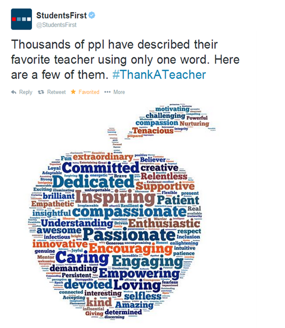
For example, a word cloud is a classic example of scale in qualitative visualization. The frequency of words is represented by their size, with larger words indicating greater relevance or prominence.
Other Examples of how SCALE is currently being used in Qualitative Data Visualization and Design:
Bubble Charts: Bubble charts use circles of varying sizes to represent different data points. The size of each circle is proportional to the value of the corresponding data point.
Emphasizing Quotes: Enlarging quotes is another common way qualitative researchers draw attention to key insights and findings
But these classic visualizations are not the only way researchers can use Scale to visualize and communicate their data.
What about using scale for storytelling?
Researchers can also apply scale to text to help create visual language for their data by varying not just the size of elements in a chart, but also changing the size of text, images, and graphics to help establish hierarchy and importance. Here are a few ideas to get you started:
Create a Visual Hierarchy:
Hierarchical proportion is a technique used in art, mostly in sculpture and painting, in which the artist uses unnatural proportion or scale to depict the relative importance of the figures in the artwork.
This is a similar principle for how hierarchy in design guides viewers through information in a structured way. By varying the scale of different elements, you can create a clear visual path, leading viewers from the most critical insights to supporting details, helping organize the narrative, make the data more accessible and digestible.
Contrast for Impact: Employ scale to create contrast and emphasize key findings. A significant difference in size between elements can draw the viewer's attention to the most important information. If all your data points are of similar size, they’ll blend together. However, dramatically enlarging key data points or visual elements will immediately draw the viewer’s attention, ensuring that critical information doesn’t get lost in the mix. By varying the scale of your elements, you can create contrast and hierarchy that will make your design more dynamic, interesting, and clear.
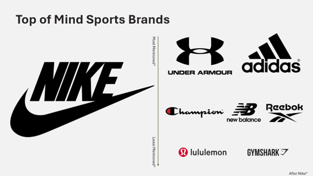
Does one brand seem to stand out or be constantly referenced by your respondents? Turn it into a visual for your viewers. I remember doing a project for a major sports wear brand and Nike (brand changed) kept coming up as top of mind for respondents. I created a slide along these lines to emphasize how prominent Nike was for respondents in this study, over other sportwear brands. I also used scale here to change the size of the logos to help emphasize how often a brand was mentioned, after Nike. (Note this slide was recreated for the purpose of this blog. This is an example only and does not reference the actual results of the study):
Create Visual Metaphors: Qualitative research often deals with nuance, where the degree of importance, frequency, or emotional impact varies across themes. Scale can represent these subtleties visually to create visual metaphors that reinforce the meaning of the data. For example, if one theme from interviews emerged far more frequently or with greater emotional intensity, making that visual element larger can help communicate its importance without needing additional explanation.
How can we gauge emotions, like trust? It’s incredibly hard to quantify, but very important for brands to understand for them to market effectively. Scale is one method researchers can use to illustrate levels of an emotion or emotional response. For example, say you had a project that was examining levels of trust in online resources. You could use scale to show what resources are more trusted vs less trusted, as shown below:
Social media, such as Facebook are shown to be less trustworthy compared to Google or Wikipedia, which are moderately trusted, where as NPR or Associated Press are more trustworthy to respondents in this hypothetical study. This is assisted by using the growing arrow to help create a visual metaphor.
Note:
While scale is essential for emphasis and focus, overuse can overwhelm the viewer and make the data harder to interpret. Striking the right balance ensures the design remains both engaging and functional. Too many oversized elements can confuse the visual hierarchy, while too much uniformity may fail to communicate critical differences in data.
In Conclusion…
There is no one right way to use scale in visual design. You can experiment with different combinations and variations of scale to achieve different effects and outcomes.
The key is to be aware of the other design principles and the possibilities of scale, then use them intentionally and strategically to communicate your key insights and findings.
By leveraging SCALE via visual design thinking in qualitative data design, your data can resonate more deeply with your audience, draw attention to the most critical aspects of your research, and make your insights and findings both informative and impactful.
Sources:
"What Is the Principle of Scale & How Should You Apply It In Graphic Design?" Microsoft.Com. Microsoft, July 28, 2022. https://www.microsoft.com/en-us/microsoft-365-life-hacks/presentations/scale-in-graphic-design#:~:text=What%20is%20Scale%20in%20Graphic,important%20element%20to%20focus%20on
"The Principle of Scale in Graphic Design." Canva.Com. Canva. https://www.canva.com/learn/principle-of-scale-in-graphic-design/
Muavia, Ameer. "How to Use Scale and Proportion in Graphic Design." Medium.Com. Medium, July 14, 2023. https://medium.com/@ameermuaviaa116/how-to-use-scale-and-proportion-in-graphic-design-1d435195d133
Masterclass. "Understanding Scale and Proportion in Art and Design." Masterclass.Com. MasterClass, June 7, 2021. https://www.masterclass.com/articles/scale-and-proportion-in-art#1JS1azmiVbu6SVXe7Kujw5
Masterclass. "What Is Scale in Graphic Design." Createcopy.Con. Createcopy, February 18, 2024. https://www.creatopy.com/blog/what-is-scale/


